Doosan Styleguide Manual
Publication Design, Brand Identity
Publication, Brand design for Doosan, a South Korean multinational conglomerate corporation.
About
Doosan is a South Korean multinational conglomerate corporation. It’s the oldest running company in South Korea and is ranked as one of the world’s top 10 largest heavy equipment manufacturer. Products they provide include, Power Plant, Desalination Plant, Diesel Engines, Construction Equipment, Construction, etc.
This project is a digital styleguide that establishes the rules for creating a cohesive look and feel of the Doosan brand. This document outlines the brand’s philosophy and the design tools needed to create company communications.
Style Guide Manual Pages
Concept
For this style guide manual, the goal was to show the brands persona through out it. Starting with a bold front cover by showing the logo nice and big, with a bright lime green. For each section page I followed the same format to clearly show the transitions from section to section. Then I followed each section with an introduction page, then the main content page. I did this for every section so that it establishes rhythm. Also maintaining the brands persona of being confident, bold, and corporate.
Styleguide on tablet
Styleguide on desktop
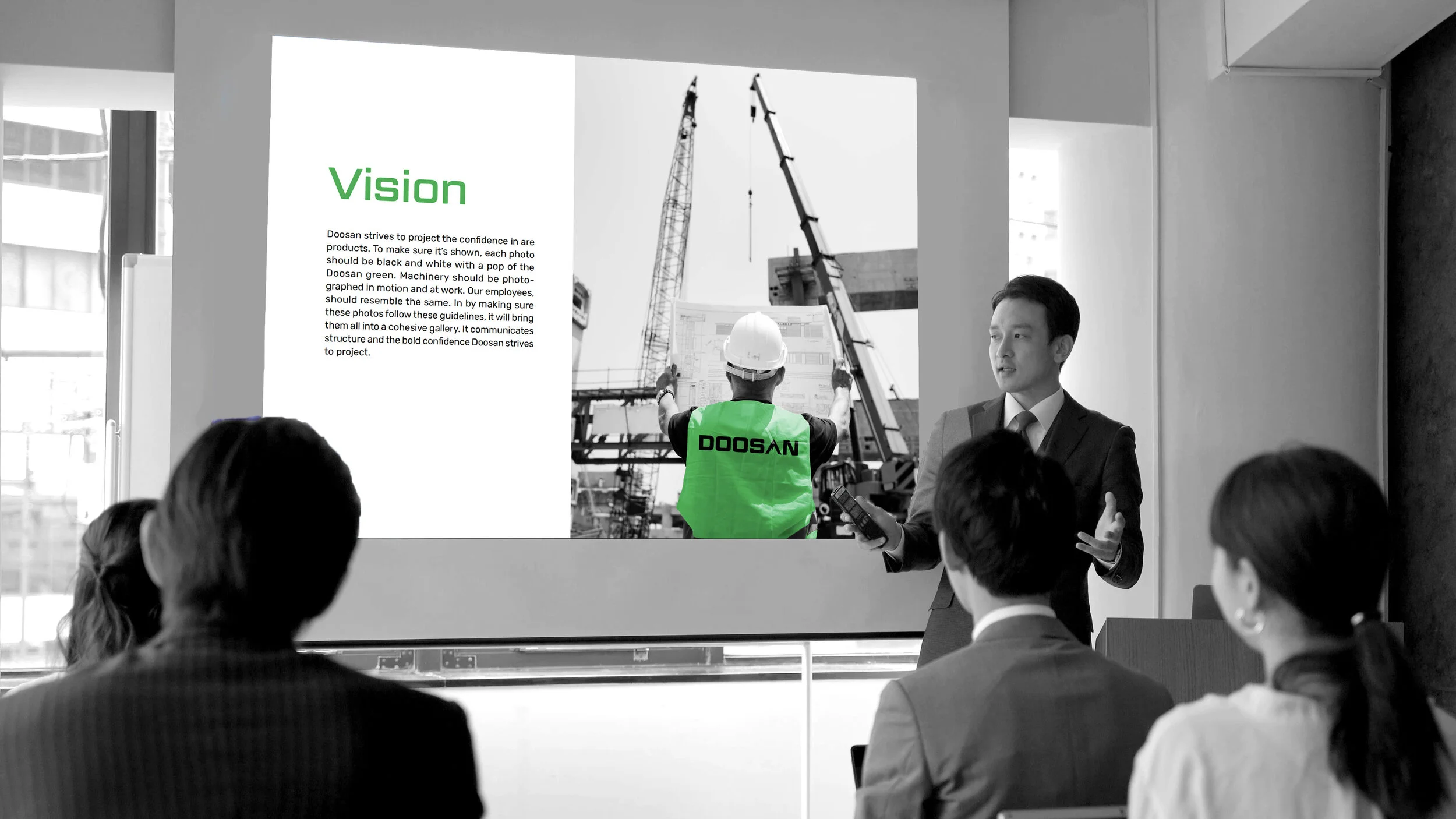
Styleguide powerpoint presentation


